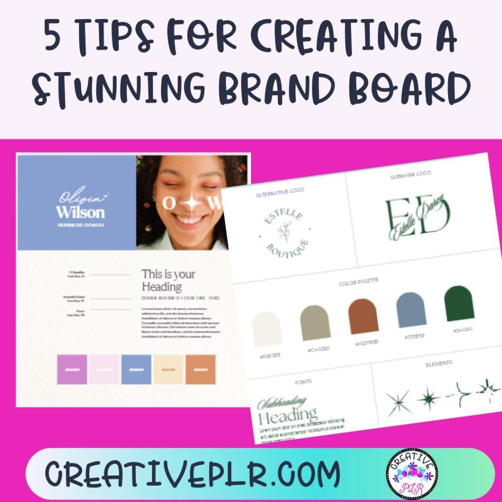
Having a brand board or mood board is important because it helps you create a cohesive look for your business. It serves as a visual representation of your brand’s identity, including its colors, typography, logo, and other key design elements. It helps ensure consistency across all marketing materials and reinforces your brand’s message. It can also be a helpful tool for communicating your brand’s identity

It also helps to communicate the brand’s personality and values to customers and potential customers, which can help to build brand recognition and loyalty. Overall, having a brand board or mood board can help to create a strong and memorable brand image.
Tip 1: Define Your Brand Identity
Having a clear brand identity is important because it helps customers easily recognize and differentiate your brand from competitors. This can lead to increased brand loyalty, more sales, and a stronger overall reputation. Additionally, a clear brand identity can help guide business decisions and ensure consistency in messaging and branding efforts.
A true story- I created my teaching resources with the same style of cover for all my different products. When my website was redesigned, I decided to refresh all those covers. Months later which searching for a product to use in my own classroom, I found a resource that I recognized immediately. I tried to find it in my store and thought there was a tech issue, but someone had decided to copy my old cover for their own product. It seems even that old, tired cover had inspired someone, lol.
A brand board is a visual representation of your brand’s identity, including key elements such as color palette, fonts, logo, and images or patterns. It helps to define your brand’s style and personality, and serves as a reference point for consistency in all visual communications. By creating a cohesive brand board, you can effectively communicate your brand’s values.
If you are a Canva user, it is easy to create there and then use for various products you may want to create. You already have a brand hub available in Canva, which can help you recolor products and social media posts in your brand color. Hit the brand color button again and try a different color combination.
Tip 2: Gather Inspiration for Your Brand Board
Gathering inspiration for your mood board is important because it helps you to visually express and communicate your ideas and vision. It allows you to explore different styles, color palettes, textures, and motifs that can inspire and guide your design process.
By collecting diverse and relevant images, you can develop a cohesive and compelling aesthetic that resonates with your audience and reflects your brand identity. Additionally, a mood board can help you to stay focused, organized, and motivated throughout your project. If you are lost for inspiration, review your board to see what inspires you.
Tip 3: Choose a Color Palette
Color plays a significant role in branding as it evokes emotions and conveys messages about a company’s personality and values. For example, blue is often associated with trust and professionalism, while red can signify excitement and energy.
The right color choice can help a brand stand out and connect with its target audience, while the wrong choice can create confusion or send the wrong message. Think about popular brands like Target and McDonalds. You recognize their logos immediately.
Here are some tips for choosing a color palette for your mood board: Consider the emotions and feelings you want your design to convey. Look for inspiration in nature, art, or other design work. Use color theory to find complementary or contrasting colors. If you need more tips, check out this previous blog post on COLOR COLOR PALETTES.
Use a limited color palette to keep your design cohesive. Experiment with different shades and tones of your chosen colors. Use online color tools to help you choose and visualize your color palette. You can use Pixabay to find a photo that you like and develop a color palette from that by uploading to Palette Generator.
Tip 4: Use Fonts to Enhance Brand
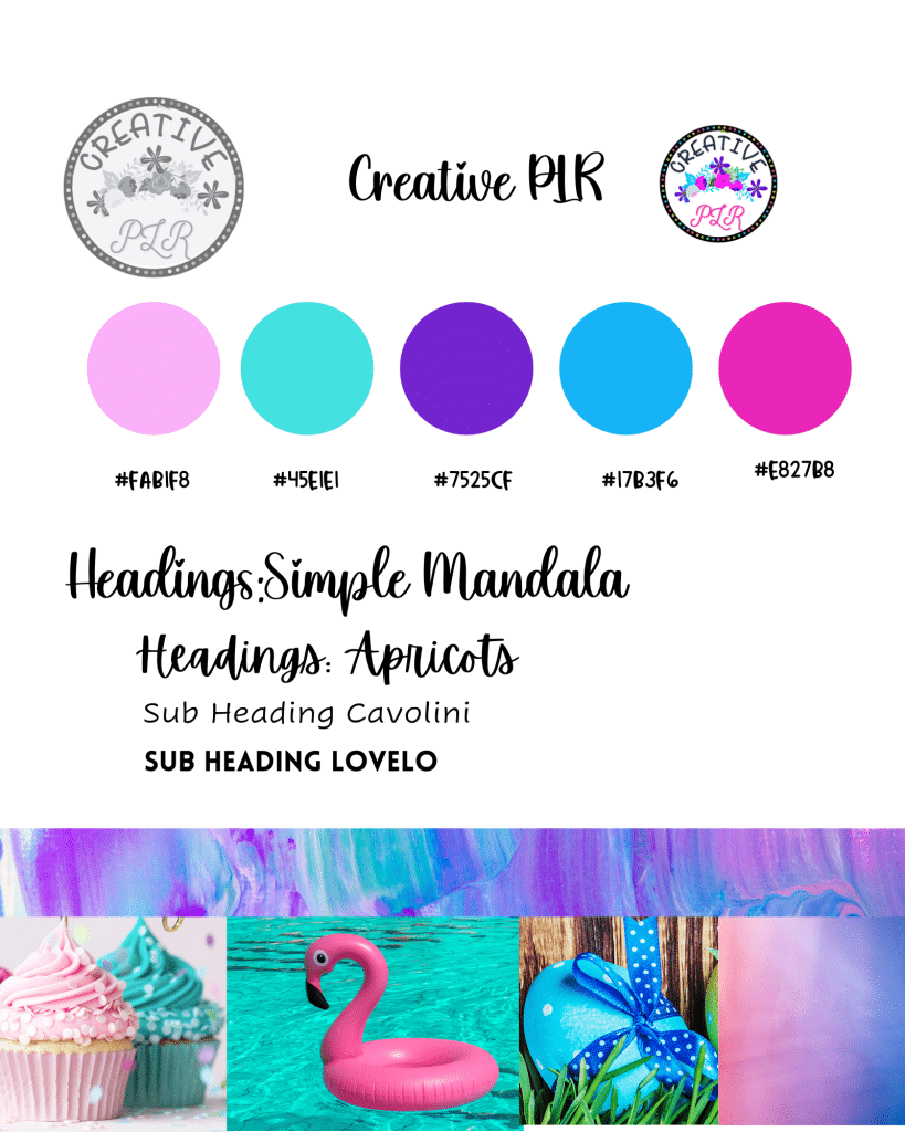
Consider the brand personality: The font you choose should reflect the personality of the brand. For example, a luxury brand may opt for serif fonts that convey elegance and sophistication, while a modern brand may choose sans-serif fonts that represent simplicity and minimalism. I like the personality of a script font, but not too elaborate. A font like Pumpkin Butter or Simple Mandala.
Think about legibility: The font you choose should be easy to read, even at smaller sizes. Avoid decorative or overly stylized fonts that may be difficult to read. Keep it simple: Avoid using too many different fonts in branding materials. Stick to a few selected fonts to maintain consistency and clarity.
Consider the brand’s target audience: Understanding the audience and their preferences is essential in selecting the right font. For example, a brand targeting children may opt for playful and fun fonts, while a brand targeting professionals may choose more formal fonts.

Use contrast: Pairing different font styles and weights can create contrast and hierarchy, making important information stand out. Overall, selecting the right fonts for branding requires careful consideration of the brand’s personality, legibility, simplicity, target audience, and use of contrast.
Tip 5: Organize Your Brand Board
Organizing your mood board is important because it helps you to visually see and understand the different elements and themes you want to incorporate into your project. By grouping similar images and colors together, you can develop a clearer idea of the overall aesthetic you’re going for. It also makes it easier to communicate your ideas with others and stay focused on your creative vision.
Choose a color scheme to guide your choices. Use a variety of images, textures, and fonts to create visual interest. Group images by theme or color to create a cohesive feel. Play with scale and layering to create depth and dimension. Use negative space to balance out the composition. Don’t be afraid to experiment and try new things. Keep it simple and avoid cluttering the board. Step back and evaluate the overall composition to make sure it’s balanced and visually pleasing.
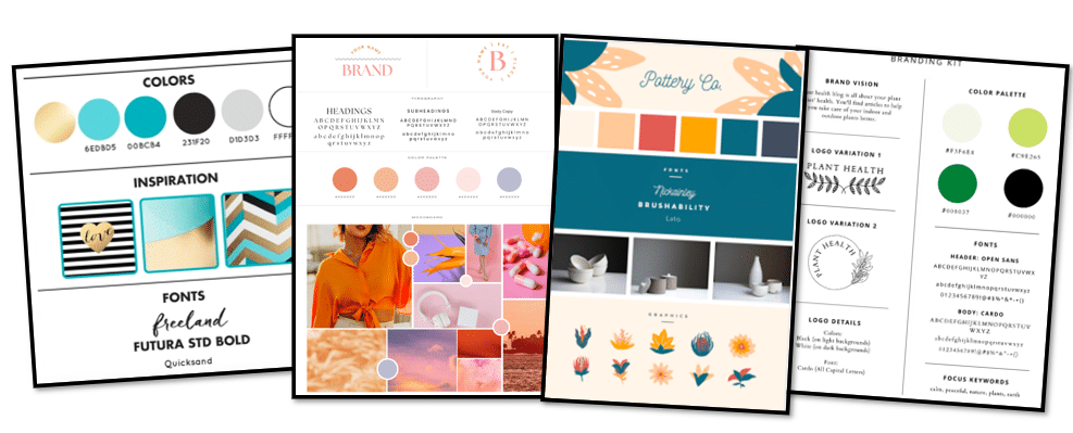
Examples
Social Media Posts are easy to brand when you have a branding board in Canva.
You can also change color schemes in products by creating a color board for that product..
