When I first started designing one of the most difficult areas for me was developing color palettes. OK, let me be specific, the difficult part was using a color palette other than pink, purple and blue. While I love other colors, I naturally gravitate to my favorites. And I did not even realize it until I looked at my ETSY shop all the packs were in the same range.

Years ago when I was taking a quilting class, the instructor told us to choose colors opposite the color wheel, so my quilt was going to be Turquoise and Orange.
I could tell by the instructors face that my color palette, based on her directions was not very attractive. But I am a go with the directions kind of person, so that was the quilt I made–and gave away because it was a little ugly to my eyes.
So I knew I needed help developing palettes that had a range of colors, not just my favorite three. I shared some of this in a previous blog post “Combining Graphic Elements”. https://creativeplr.com/combing-graphic-elements/
Someone emailed me and said they liked the idea, but needed more information. I use Photoshop for most of my creating, however this same method will work for PowerPoint. So here is the method and resources I use.
1. Pixabay.com
I love Pixabay because you are only limited by your imagination. Start with an idea of season, mood, color or topic that you are interested in. I put Rain Forest in the search bar. Of course, my first gut reaction was to put in ocean sunrise–back to the pinks, purples and blues but I am trying to expand.
Here is the first page of that search. You will notice a variety of colors here. A lot of greens, some subdued colors, some very dark and others with not a lot of range of colors.

I typically download several different photos at one time. Some of the things I look for is a range of colors from light to dark, rich bright colors, and lots of variation of colors. Usually tone on tone colors in photos don’t work that well or translate on the palette.
In the display above I wouldn’t use the all misty grey image, And I probably would steer clear of the snowy one, this mutes all the colors. Instead, the bright green forest scene on the third row is pretty and the colors crisp. I chose 3 of the images on the first two pages.

2. Palettegenerator.com for Color Palettes
Once I have a variety of pictures to try out, I got to Palettegenerator.com and upload them. You can upload multiple pictures at one time and then view them individually.

Once they are uploaded, I select one of the photos and view the color palettes. Not every color or shade will display. The generator selects the 6 most used colors but you can extend that to 10 colors by using the slide. Even with that, you will get a version of the 10 most used colors but this is not exact.


You will notice in the 6 colors selection, you don’t see the soft greens in the picture at all. When I adjust the slide to get more colors I still don’t get those soft greens. So this is not exact, but for most palettes it is very close and is useful. You could create any type of printable using the colors in this neutral palette. But if you were specifically looking for more green, perhaps you might want to try another method.
3 Coolors.co for Color Palettes
Sometimes if I am not satisfied with the way that the color palette is looking, or need more of a specific color, I will upload my photos to Coolors.co using the image selector. Once you log in (free), click on tools and select image picker.


Then upload the image you want to use. You will notice that it also selects the 6 most used colors in the image.

The nice thing about his tool is that you can move the cursor over a color that may not be included in the color palette. You can add colors using the plus sign next to the other range of colors. Then select a color and use the cursor to find new colors. See how I added the soft greens to the palette by clicking on a dark color and hovering over the green in the photo?

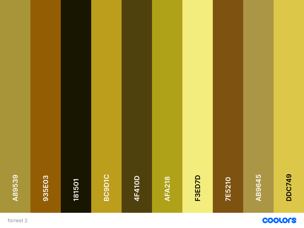
And I also added the soft gold color in the brush. Once you are satisfied with your colors, export the palette as an image and you will have the colors and the hex codes.

Whether you use Palettegenerator.com or Coolors.co, you will have the hex codes for the palette you generated.
I use Photoshop for a lot of my graphics. In Photoshop, the palette with the hex codes can be uploaded as a layer. Then the color picker can be used to select a color or the hex code can be entered to find the color. Note: even though you have these colors that you generated, when you are translating the colors to you software choice (affinity, Photoshop, PowerPoint, or ? ), you can still add other colors that are in the neighborhood.
In the above palette, I could add several more light shades with a pale green and a very pale gold
4. PowerPoint.
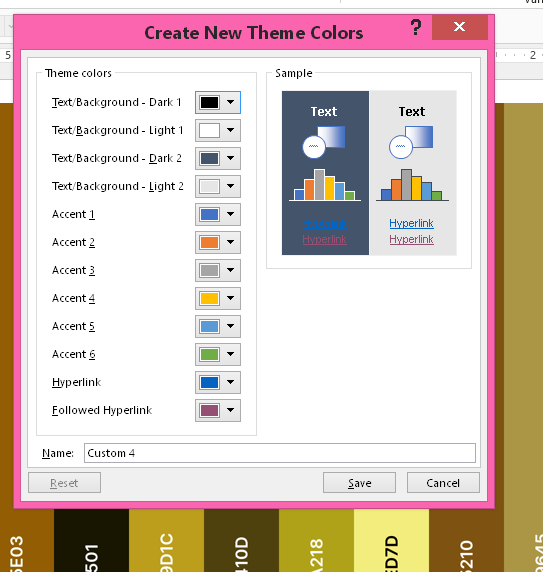
How do you do this in PowerPoint? You can create a whole color theme in PowerPoint easily. In PowerPoint, click on Design then on the arrow next to “variants”.

Once you select that arrow, select color. Then create custom color.

This window allows you to add a color scheme for each area. I always keep the white for a background in addition to my other colors. To change the colors, click on the arrow next to each one and you can add the hex code
Once you have added all your colors, save it under a name. I used the name Forrest2.
You can now use your color scheme to make presentations, color backgrounds, text, graphics, icons, etc. Use the color palette to color or recolor graphics as well.
You can choose your new color theme to make frames and you can see the different colors in your palette.
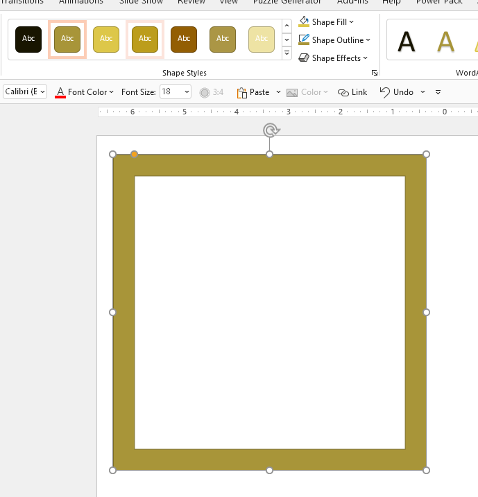
You can make frames, use any of the shapes and recolor in whatever color palette you have created.
I hope this was helpful to you. The use of Pixabay to help create new color themes has really expanded my ability to create in a variety of colors. All of the resources–Pixabay, Palettegenerator and Coolors are free to use, so you can explore to your hearts content.
You can also try creating color palettes for sale. If you work in Procreate or Affinity, there is a market for different palettes. Go a little wild with color. It has helped me get out of my comfort zone. Drop a comment or email me at [email protected] if you need more help.
Looking for more information on creating products and printables? Check out these blog posts: CREATING WALL ART and CREATING AND SELLING COLORING PAGES