Designing graphics for commercial products can be a daunting task, but with a few simple tips, you can create stunning visuals using just a few graphic elements. Of course, we all have our own style so what looks great to you might not please everyone. But do not be discouraged. Here are some things to keep in mind when designing graphics for products you want to sell.

First, make sure your designs are unique. This will help them stand out from the rest and avoid any potential copyright issues. I recently posted a journal on ETSY. When I searched for similar journals, imagine my surprise when I saw numerous sellers with the exact same journal. There were at least 9 that were using the cover that was sold with the PLR journal. Even when you purchase a PLR product, you need to charge it up so it stands out as unique.
Secondly, think about the overall message you want to convey with your design. What feeling do you want to evoke? Do you want happy? Elegant? All those feelings are using represented by the color scheme you choose. I tend to prefer jewel tones, so I have forced myself to expand my palettes.
Choosing Colors

Here are 10 Tips to help you get started designing your own graphics:
1. Start with an Inspiration for Your Graphics
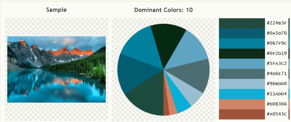
Choose an image that will be the foundation for your design. This could be a simple picture or a more complex image, like a landscape or portrait. This could be an inspiration image or idea that you found on the internet. If you start with some inspiration, it will give you a focus and direction.


2. Create a Mood Board for Your Graphics
Before you start combining your clip art, create a mood board to help you visualize the overall look and feel of your design. To do this, simply gather all of the clip art you plan on using and arrange it in a visually appealing way. Use your inspiration picture or palette to make sure the colors go together.
For me, it is easier to start with too many images than not enough. This way I can find the best combinations and eliminate any that just don’t work. Sometimes until you start working you may not be able to visualize how a particular graphic element is going to work.
3. Use Contrasting Colors in Grahics
Make sure your graphics are easy to see by avoiding low- contrasting colors. If the contrast is low, individual elements will blend together. I won’t tell you to use a color wheel. Years ago I was taking a quilting class and stumped on what colors to use. The teacher told me I could not go wrong if used a color wheel and colors that were opposite so I chose blue and orange (the color wheel chose). One look at the teacher’s face told me I did go wrong…..

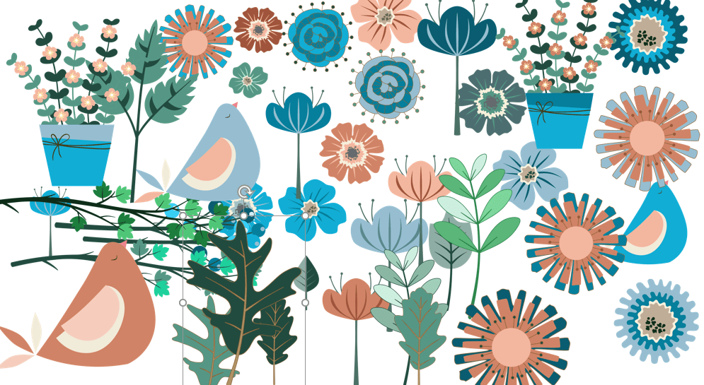
In the above picture I added all my graphics I created using my inspiration image to a single slide in PowerPoint. You can see there are a variety of light, medium and dark shades as well as colors from the range in the color palette. Of course, I would not use ALL of these images in one product, it would be overwhelming, but it is great to have options.
4. Find Complementary Clip Art
Once you have your base image, start searching for clip art that will complement it. Try to find images that share similar colors, shapes, or themes. There are several great places to find clip art, but make sure you check the licenses before you purchase. I have purchased packages that I was planning to use only to find that the license was limited and could not be used in commercial projects.
Keep in mind that you may not find the perfect match, but you can come close and in PowerPoint, you can change the colors of all the images. This is one solution, but PowerPoint has a standard theme of colors so if you are partial to lime green, it may not be available.
5. Consider the Layout Before Graphics
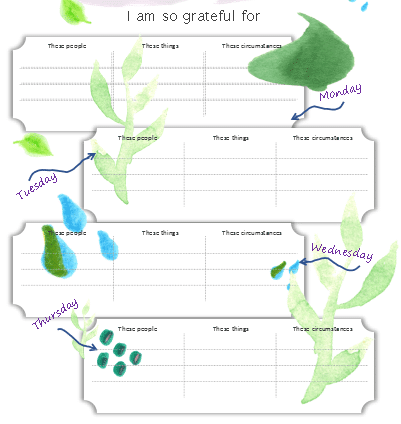
The way you layout your graphics is just as important as the graphics themselves. Make sure to consider the layout of the planner or journal and how your graphics will fit into it. Clip art elements should not compete with the tables or journaling boxes. You do not want to overflow into the areas where the user will be writing. And if you use a background image, it needs to be lighter so raise the transparency.

Look at the image above. In full disclosure, this lovely journal was not sold like this. I increased the size of the graphic elements so illustrate a point about considering the layout. If someone needs to write in the table, or read the headings, you need to be able to see them. In this case, the elements worked best on the edges of the table or in the borders, no on top of the tables.
If you are using elements in the background, always check how they look after the transparency has been adjusted. You can’t always tell by looking at the screen.
6. Use the Right Tools
Not all software is created equal when it comes to combining clip art. Some programs, like Photoshop, allow you to layer and manipulate your images in a variety of ways. But in PowerPoint and Keynote you also have the advantage of layering images by using the selection pane. You can also change the color of images in PowerPoint and while I do love Photoshop, there are some advantages to using PowerPoint.
7. Experiment with Clip Art
Don’t be afraid to experiment with your clip art. Try different combinations and see what works best. You only improve when you consistently work at it. And be kind to yourself. I create at night and am usually pleased but the next morning I look at it and have second thoughts. If you will notice planners and journals that you purchase have beautifully created covers where there is a lot of graphics but less on the inside pages.
8. Keep Your Graphic Design Simple
Overly complicated designs can be confusing and even off-putting to your audience. Try not to overdesign, which gets tricky. Less is often a better choice. Opt for simple designs that are easy, beautiful, and do not overwhelm the end product. Think of it like accessorizing a favorite outfit.
9. Get Feedback on Your Graphics
Once you’ve created your design, don’t forget to get feedback from others. Ask friends, family, or even strangers what they think of your work. Their feedback can help you make improvements to your design. If you belong to a Facebook group that is focused on design, try asking for feedback on an image. Or send out an image to your email list and ask for feedback.
10. Consider Your Audience
Think about the audience you serve and your project. Do the colors covey the right tone for the project? Would it appeal to your audience? I work with teenagers so when making clip art for them, I change the images and colors to appeal to that group. If you are making products for small children, bright primary colors are often used.
For more information on using simple tools to help you create color palettes: Finding Color Inspirations for color Palettes
I hope this has been helpful. If you have questions, drop a comment below or email me at [email protected].