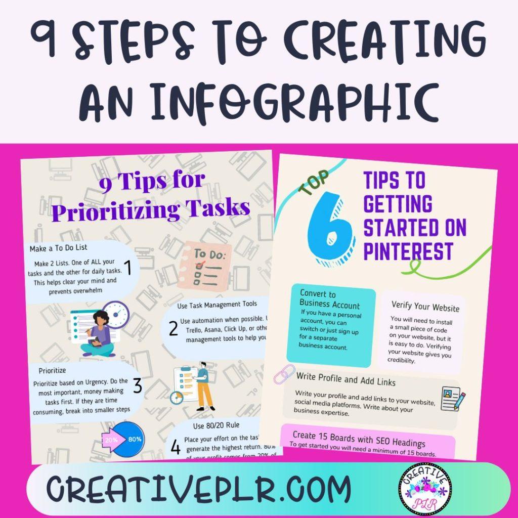
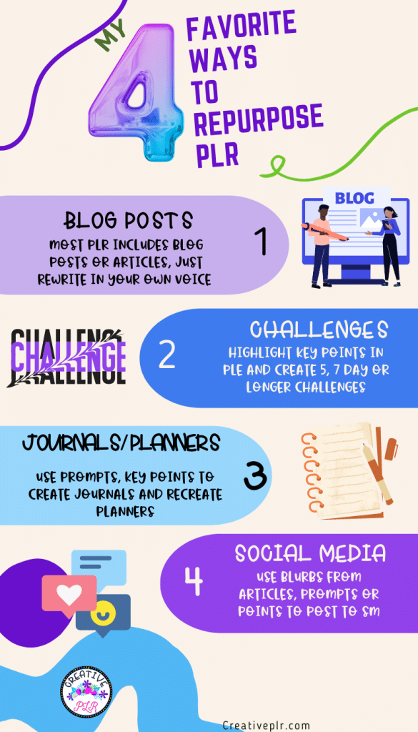
Whenever repurposing is mentioned, one suggestion is always create an infographic. Some people like visuals instead of the printed word or long blog posts. Others like to print out the image and have a visual reminder. If you are using your infographic to give step by step instructions, it is handy to keep that available.

And while I have created a lot of “Infographics”, I did not call it that. I created classroom signs, procedures written out in visual form for students. Whatever you call it, creating an infographic is a great idea if you have a how-to blog post.
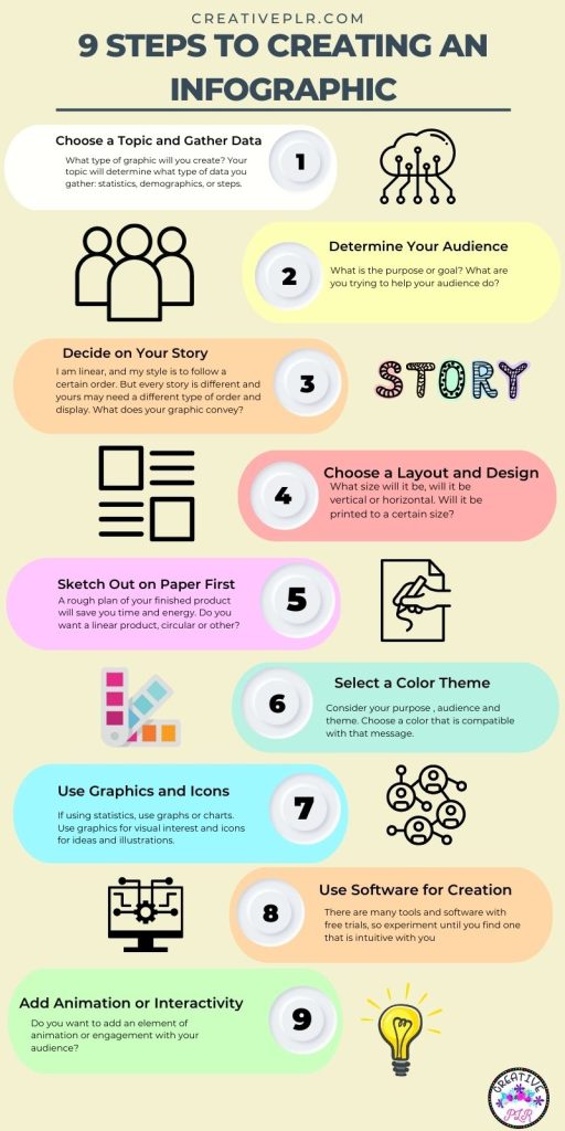
Choose a Topic and Gather Data
To choose a topic for an infographic, start by identifying a subject that is visually appealing and relevant to your audience. Once you have a topic, gather data from reputable sources such as government websites, academic journals, and industry reports. Look for statistics, quotes, and other information that support your theme.
Organize your data into categories or sections that make sense, and then design your infographic to highlight the most important data points. Remember to keep your design visually appealing and easy to read.
Determine Your Target Audience
To determine your target audience when creating an infographic, consider factors such as demographics, interests, and needs. You can also conduct research to better understand your target audience and tailor your infographic to their preferences.
It’s important to keep in mind that your infographic should be visually appealing and easy to understand for your audience.
Decide on the Story You Will Tell
When deciding on the story you want to tell with your infographic, start by identifying the main message or point you want to convey. Consider the data or information you have available and determine what story it tells.
Think about your target audience and what they would find most interesting and relevant. Keep in mind that a good infographic tells a clear and compelling story that is easy to understand at a glance.

Choose a Layout and Design Style
To choose a layout and design style, consider the purpose and audience of your project. Research design trends and gather inspiration from similar projects. Experiment with different layouts and styles to find the one that best fits your needs. Don’t be afraid to ask for feedback from others to help you make a decision.
If this is a project that will be printed, you will need to consider the size and how it will fit on standard sizes of paper. If this is an image and you want to post to pinterest or share on other social media platforms, will it’s size be cut off?
Sketch out Your Infographic on Paper First
Sketching out your infographic on paper or using a tool can help you visualize the layout and structure of your design before investing time and resources into creating it digitally. It allows you to experiment with different ideas and make quick iterations, helping you refine your design and save time in the long run.
Additionally, sketching can help you communicate your ideas more effectively. Do you want a linear plan where there is a stating point and each point follows or is your idea circular where you can start anywhere and choose the next path from options?

Select a Color Scheme to Fit Your Message
Choosing the right color scheme and typography can greatly enhance the effectiveness of your message. The colors and fonts you choose should be consistent with the tone and purpose of your message, and should also be visually appealing and easy to read.
For example, if your message is serious or professional, you may want to use a more muted color palette and a traditional font. On the other hand, if your message is playful or creative, you may want to use brighter colors and a more whimsical font.
Ultimately, the key is to choose a color scheme and typography that helps your message stand out and resonate with your audience. You will also want to brand your image. Add a logo and your website name especially if you are going to use on social media. And if you do not want to add a logo, consider using a watermark of your logo.
Use Graphics and Icons
To use graphics and icons to illustrate your data, you can create charts, graphs, or infographics that visually represent the information. You can also use icons to represent different categories or types of data.
Make sure to choose visuals that are easy to understand and add value to your data presentation. There are many tools and software available to help you create professional-looking graphics and icons.
Use a Tool or Software to Create Your Design
There are several tools and software used to create infographics, including Canva, Piktochart, PicMonkey, Adobe Illustrator, Venngage, and Easel.ly. Canva has lots of templates, and if you have Canva Pro, why pay for another program?
However, several of those tools listed have a free trial so it might be fun to try them all out. Check the different templates.
Add Interactivity or Animation if Desired
To add interactivity or animation to an infographic, you can use tools such as Adobe Animate or HTML5. These tools allow you to create animations and interactive elements such as buttons, pop-ups, and hover effects. You can also consider using tools like Canva or Piktochart, which provide built-in animation features to make your infographics more engaging.
But consider how your finish product will be used. If it is to be printed, those additional elements may not work.
Review Before Publishing or Sharing
How many times have you published something and then realized there is a misspelling or typo? I do it all the time, daily in fact. So take a quick pause or break and then come back and view your product again. It is easier to catch those mistakes with a fresh eye.
Review the content to ensure that all information is accurate and up-to-date. Check the design elements, such as color scheme and font selection, to ensure they are visually appealing and consistent. Get feedback from others, such as colleagues or friends, to identify any areas for improvement.
Test the infographic on different devices and platforms to ensure it is accessible and displays properly. Make any necessary revisions and then publish or share the final version. Or ask someone else to look it over for you. If you have Facebook friends, just post. There is always someone who catches every little mistake.
I used Canva to create the infographics shown here. You can use any software that you are familiar with, even PowerPoint. If you are not familiar with all the ways that Canva can help you design different items for your business, check out this previous blog post on CREATING WITH CANVA.